> For the complete documentation index, see [llms.txt](https://docs.sonarsource.com/llms.txt). Markdown versions of documentation pages are available by appending `.md` to page URLs; this page is available as [Markdown](https://docs.sonarsource.com/sonarqube-cloud/managing-portfolios/portfolio-dashboards/viewing-and-managing-dashboards.md).
# Viewing and managing dashboards
You can monitor key metrics of your portfolio, identify risks and communicate progress using configurable dashboards.
This feature is available in the [Enterprise](https://www.sonarsource.com/plans-and-pricing/sonarcloud/) plan.
## Retrieving portfolio dashboards
To retrieve **Dashboards**:
1. Retrieve your portfolio. See [Viewing portfolios](/sonarqube-cloud/getting-started-with-enterprise/viewing-enterprise-reports/viewing-portfolios.md#retrieving-portfolio) for more information.
2. Go to **Dashboards** > **All dashboards**. The **All dashboards** page opens and lists all available dashboards.
## Permissions
* The **View** portfolio permission is required to view, create, and edit dashboards. See [Administering portfolios](/sonarqube-cloud/getting-started-with-enterprise/administering-portfolios.md) for more details.
## A list of all dashboards
The **All dashboards** page shows a list of dashboards for your portfolio.
1. Select **All**, **Built-in**, or **Custom** to filter dashboards, or use search to find one by name.
2. Select **Create custom dashboard** to create a new dashboard. See [Creating dashboards](/sonarqube-cloud/managing-portfolios/portfolio-dashboards/creating-dashboards.md) for more details.
3. The list is organized by **Dashboard name**, **Last edited**, and **Creator**.
4. The action menu at the end of each row shows:
* **Edit name and description**: Available to custom dashboards.
* **Edit dashboard**: Available to custom dashboards.
* **Duplicate**: Available to custom and built-in dashboards.
* **Delete dashboard**: Available to custom dashboards.
### Built-in dashboards
SonarQube Cloud includes one built-in dashboard for portfolios:
The **Portfolio health dashboard** provides teams with an immediate view of a portfolio’s health by surfacing key measures, trends, and risk breakdowns for overall code across Security, Reliability, and Maintainability, while also monitoring coverage and duplication.
## Viewing dashboards
Dashboards comprise configurable widgets. Depending on the measure type, widgets can be count, badge, line and multi-line, pie, donut, and top list charts.
### Count
Count represents a single metric. It displays a numeric value for a measure, such as the number of security hotspots or the duplication percentage.
* The chart shows whether the data applies to new code or overall code.
* Click the value to drill into the details.
* If enabled during widget creation, the widget displays the net change in the last 30 days.
### Badge
A badge represents a single metric. It displays the current rating for a measure, such as a security rating or reliability rating.
* The chart shows whether the data applies to new code or overall code.
* Hover over a slice to reveal more information.
* Click a slice to drill down into the details.
### Line and multi-line charts
A line chart represents metrics that change over time and displays historical data for a selected measure.
A multi-line chart becomes available when you apply a **Group by** filter to a supported metric. For instance, you can select **Issue count** and group the results by **Software quality**.
* Hover over a line to reveal a tooltip with additional information.
* Line charts apply to overall code only. When the selected metric supports it, the chart is grouped into multiple lines.
* If enabled during widget creation, the chart displays a legend.
### Donut and pie charts
Donut and pie charts display information across multiple values.
* Hover over a section of the donut or pie chart to reveal a tooltip with more information.
* Click a section of the chart, or its legend, to drill down into the details.
* The chart shows whether the data applies to new code or overall code.
* If enabled during widget creation, the chart displays a legend.
### Top list
Top lists display the leading results for a specific metric and their associated trends. For instance, you can view the top five rules that raised issues, filtered by their open status.
* Click a row to drill down into the details.
See the [Creating dashboards](/sonarqube-cloud/managing-portfolios/portfolio-dashboards/creating-dashboards.md#metrics) section for more information about the metrics used by the dashboards.
### Missing a visualization or metric?
Your feedback is important to us. Submit your ideas for a visualization or metric that you would like to see in Dashboards through our [Portal card](https://portal.productboard.com/sonarsource/1-sonarqube-cloud/c/802-dashboards-improvements).
### Drilling down on metrics
Widgets contain clickable parts that you can use to drill down into metrics and measures. After you click one, a separate page shows a breakdown of the metric or measure by project. You can drill down from all widgets except the line chart.
1. Click different parts of the widget to filter the project results shown in the **Breakdown by projects** section.
2. Use the drop-down menu to filter the results.
3. **Breakdown by projects**: View the results of the projects affected by the metric or measure. Only the projects you have the Browse permission for are listed. Use the search box to filter the list by project name.
1. Click the project name to navigate to the project's Summary page.
2. Click the number of issues or a rating to navigate to the project's Issues or Measures page.
## Editing a dashboard
Navigate to the custom dashboard you want to edit and select **Edit dashboard**. Alternatively, go to the **All dashboards** page and select **Edit dashboard** from the action menu on the right side of the dashboard.
In edit mode, you can:
* **Cancel and exit**: Exits the edit mode without saving the changes.
* **Save changes**: Saves your changes.
* **Add widget**: Choose from the available widgets.
* **Add section**: Sections group a set of widgets together and are collapsible.
See [Creating dashboards](/sonarqube-cloud/managing-portfolios/portfolio-dashboards/creating-dashboards.md) for more details about how to create and customize the widgets and sections.
### Organizing your dashboards
**Widgets**
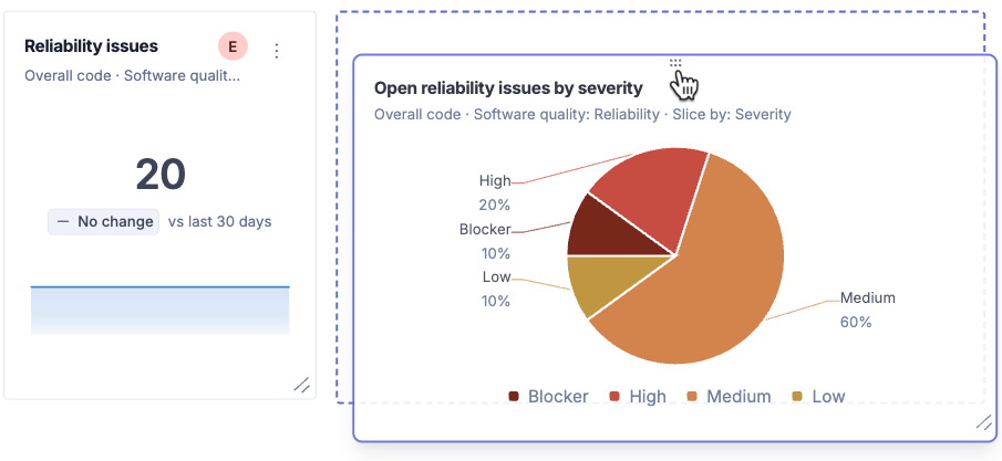
You can organize widgets by moving them from one section to another. In edit mode, click the handle located on top of a widget and drag it to another location.
You can also resize a widget by clicking and dragging its lower-right corner.
**Sections**
Like widgets, you can drag sections from one location on the dashboard to another.
Sections remain collapsible after you save your changes and exit edit mode. This helps you save screen space and show only the information you need at a given moment.
## Related pages
* [Portfolio dashboards](/sonarqube-cloud/managing-portfolios/portfolio-dashboards.md)
* [Creating dashboards](/sonarqube-cloud/managing-portfolios/portfolio-dashboards/creating-dashboards.md)
---
# Agent Instructions
This documentation is published with GitBook. GitBook is the documentation platform designed so that both humans and AI agents can read, navigate, and reason over technical content effectively. Learn more at gitbook.com.
## Querying This Documentation
If you need additional information that is not directly available in this page, you can query the documentation dynamically by asking a question.
Perform an HTTP GET request on the current page URL with the `ask` query parameter, and the optional `goal` query parameter:
```
GET https://docs.sonarsource.com/sonarqube-cloud/managing-portfolios/portfolio-dashboards/viewing-and-managing-dashboards.md?ask=&goal=
```
`ask` is the immediate question: it should be specific, self-contained, and written in natural language.
`goal` is optional and describes the broader end goal you are ultimately trying to accomplish on behalf of the user. GitBook uses it to tailor the answer towards what is most useful for that goal.
The response will contain a direct answer to the question and relevant excerpts and sources from the documentation.
Use this mechanism when the answer is not explicitly present in the current page, you need clarification or additional context, or you want to retrieve related documentation sections.
.png?alt=media)

.png?alt=media&token=56e09569-e8be-4b2d-942d-915c14641701)
.png?alt=media)
.png?alt=media&token=d4c47a14-4245-46a6-bb75-ac468d167b01)
.png?alt=media&token=330cfc3e-05ea-4253-88d6-9727cd4547a5)

.png?alt=media)