Filters and perspective
Visualizations are available to help you gain deeper insights into your projects' current statuses and histories.
How do I compare current state for multiple projects or project components?
The Projects space allows you to filter the projects in your instance by multiple, measure-based criteria. Once you've chosen your set, you don't have to stare at the raw numbers to identify the risks its projects face. Instead, several visualizations (Projects > Perspective) are available to help you understand each project's relative position in terms of each of the major axes:
- Risk - reliability and security ratings, test coverage, technical debt, and lines of code
- Reliability - reliability rating, reliability remediation effort, lines of code, and bug count
- Security - security rating, security remediation effort, lines of code, and vulnerability count
- Maintainability - maintainability rating, technical debt, lines of code, and code smell count
- Coverage - coverage, complexity, and uncovered lines
- Duplications - duplicated lines %, lines of code, and duplicated blocks
- At the project level these same visualizations are available in the Measures tab to help you compare project components. The Project Overview corresponds to the Risk visualization in the Projects space, For the other five graphs, choose the Overview option under the relevant domain.
Additionally, tree maps are also available for percentage and rating metrics at the project level. Navigate to them in the Measures tab using the perspective selector in the right pane.
How do I visualize metric history?
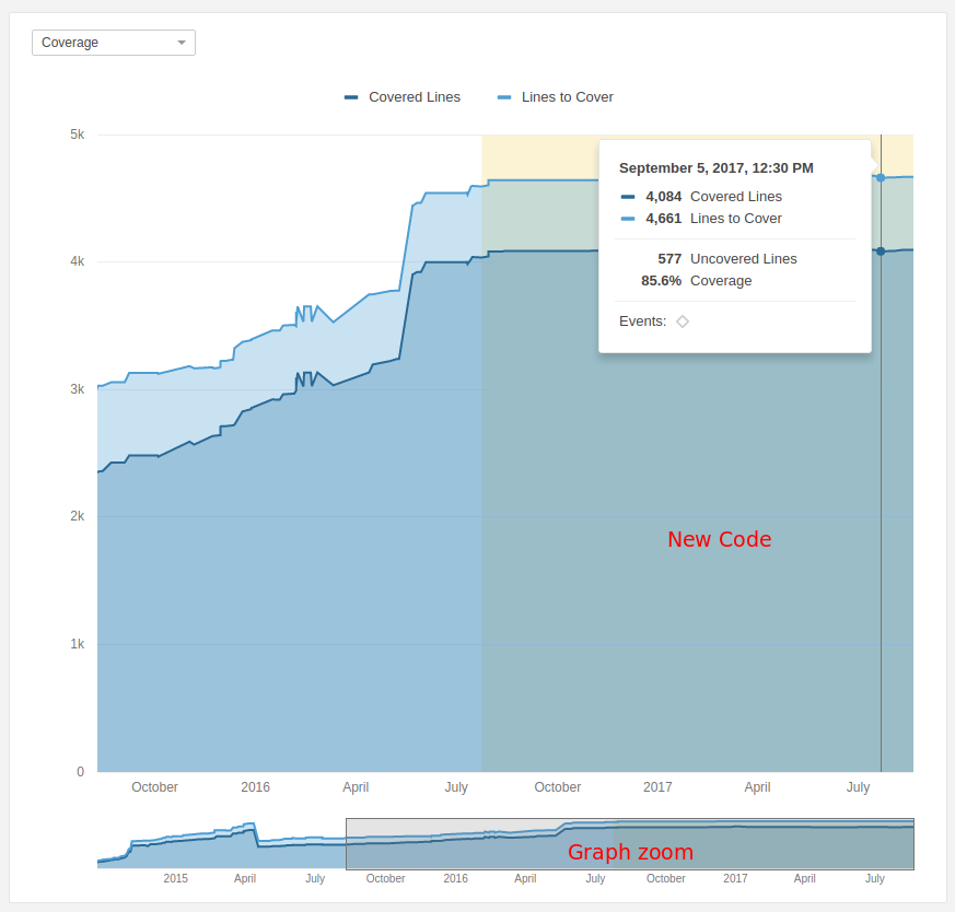
At the project level, the Activity tab offers several canned line graphs of selected metrics across time, with convenient mouseovers to show graph details and the ability to easily narrow the graph to a slice of the project's history. Beyond the canned graphs, you also have the ability to map the metrics of your choice against each other in a custom graph.

Was this page helpful?